A step-by-step narrative of how Waste Wise guides users from awareness to insight — from first landing on the globe to comparing two countries side-by-side.
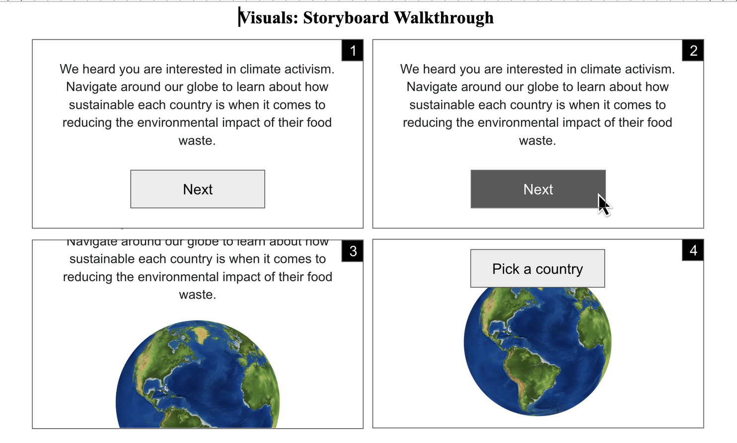
When a user first arrives, they are greeted by a full-screen intro modal overlaid on the dark globe. The card states the mission clearly — climate activism through food waste data — and prompts them to begin exploring. Clicking "Explore the Globe" dismisses the modal with a fade transition, revealing the animated 3D globe beneath.
Navigate around our globe to learn about how sustainable each country is when it comes to reducing the environmental impact of their food waste.
The globe auto-rotates slowly. Countries are color-coded from green (low waste / strong policy) to red (high waste / weak policy) based on the active metric tab at the top. A legend in the bottom-left explains the scale. The user can drag to rotate, scroll to zoom, and switch between Heatmap and Elevation modes — the latter raises countries as 3D bars proportional to their score.
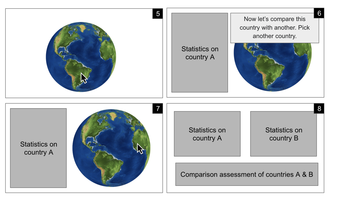
Clicking any lit country on the globe opens a slide-in sidebar panel on the right. It shows the country's flag, income group, and region, followed by a highlighted card displaying the currently selected metric value and the country's ranking among all 28 nations. Below that, a full stats grid covers waste by sector, a policy score progress bar, and the strength of each of the six policy dimensions (liability protection, tax incentives, date labeling, food safety donation, waste deterrence, government grants).
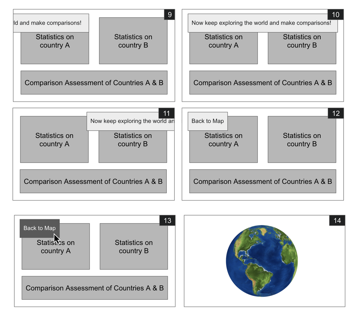
After viewing one country's profile, the sidebar prompts: "Now let's compare this country with another — pick a second country on the globe." Clicking a second country splits the sidebar into two columns, showing both profiles simultaneously with a Comparison Assessment section below, synthesizing key differences in waste behavior and policy strength. Users can keep picking new comparison countries freely, or click "Back to Map" to reset.
Users who want to explore all countries at once navigate to the Data Table page. This sortable, filterable table shows every row of the master overview dataset — all 28 countries across 2019 and 2021. Users can sort by any column (click headers), filter by year, region, or income group, and search by country name. Waste values are color-coded red/yellow/green for instant visual scanning, and inline mini-bars represent relative magnitudes.
The wireframe walkthrough used during planning, showing the full sequence from intro to country comparison.
Spin the globe and discover how your country stacks up on food waste and climate policy.
Launch the Globe →